
 There are hundreds of brand design firms out there, so what makes us, at REKOR, any different? REKOR gets to the core essence of a project through qualitative research with your stakeholders and customers before, during, and after the project.
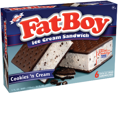
Small details make a huge difference in that first look a customer takes at your product (and that first look only lasts about 3-5 seconds). It’s easy to make a pretty package but the real reward comes when you develop a package that makes sales go up. For example, we helped out Fat Boys with their retail-packaging. Fat Boys was wondering if their premium “real” ice cream needed to be changed into a more “Skinny Cow” and healthy type of product. Someone told them, “No one wants a fat product.” Through consumer research we found that that one single perspective did not represent their consumer group. There were strong emotions that truly drove the love of Fat Boys. The consumer saw the fat as the thickness of the ice cream and who wouldn’t want more of that great homemade real ice cream? It wasn’t just an ice cream sandwich bar, Fat Boy ice cream sandwiches are memories of spending time together and the satisfaction of having the best of “Real” ice cream.
Through our research on the Fat Boy project, we have learned 10 key branding items that we needed to bring into the packaging design. One of those was that the brand and packaging needed an equity transfer for the brand that would not lose any existing recognition, but would give the package a better read through the freezer case. We also learned through research that the emotions of the history and authenticity of the brand design needed to be stronger, which is exactly why we brought in the “Since 1925” and “Thick and Creamy” into a higher visibility area. These were just a few things we learned during the qualitative research. It was key for us to understand the customer in our research so that we could develop concepts that would make a real difference. With retail packaging or food packaging the key element is photography. Testing was conducted on what would make the most mouth watering shot. The cut of the ice cream, the color of the coverings, backgrounds and more were tested. Small differences like this can make all the difference for a successful campaign.
Once several great packaging 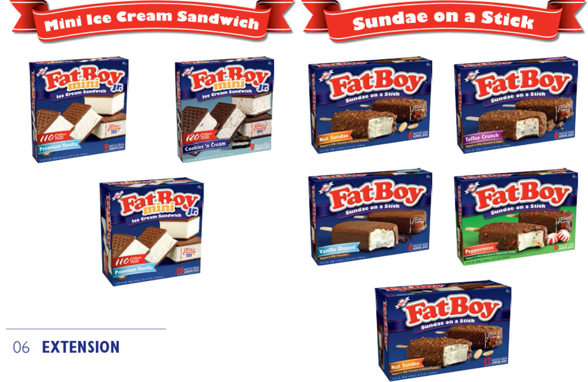 design were developed, we did consumer research to test the packaging designs and found out what elements appealed the most to individual consumers. What description put across the right message? What font and colors brought out the most readability? These elements were designed into a retail package that had buyers and customer excited. The design research helped Fat Boy’s new packaging really communicate. Sales went up by 30% the next season for Fat Boy. Once we had a package for Fat Boy that we knew worked, we then extended the design to all flavors of the line and developed a style guide to give direction for future projects.
This kind of a style guide makes future work, collateral, banners, signage, pop much quicker, easier and cheaper to do.